Your logo serves as the initial touchpoint for your wellness brand—it’s the face of your identity, the first impression you make, and a visual cue that conveys trust. Whether you operate a yoga studio, a mental health platform, or an organic skincare brand, your logo should immediately evoke a sense of calm, harmony, and holistic wellness.
With that in mind, how do you design a logo that resonates with your audience? To answer this, let’s delve into the latest trends and timeless elements that help wellness logos truly stand out.
Why Your Logo Should Reflect Wellness Values
A great wellness logo isn’t just about looking pretty—it’s about evoking the right emotions. People seek health and wellness brands for relaxation, healing, and self-improvement. Your logo should visually communicate these values.
Think about the logos of leading wellness brands. They often use soft colours, natural elements, and clean, calming fonts. There’s a reason you don’t see bright red, harsh angles, or chaotic designs in this industry!
✓What Makes a Wellness Logo Effective?
✻ Simplicity: A clean, minimal design is easier to remember and instantly recognizable.
✻ Natural Elements: Leaves, waves, circles, and organic shapes reflect balance, harmony, and health.
✻ Calming Colors: Earthy greens, soft blues, and neutral tones create a sense of relaxation and trust.
✻ Readable Fonts: A font should be easy to read and match the personality of your brand.
✘Common Mistakes in Wellness Logo Design
- Overcomplicated Designs: Too many details can make your logo look messy and unprofessional.
- Generic Symbols: Using a standard leaf or lotus without originality can make your brand blend in rather than stand out.
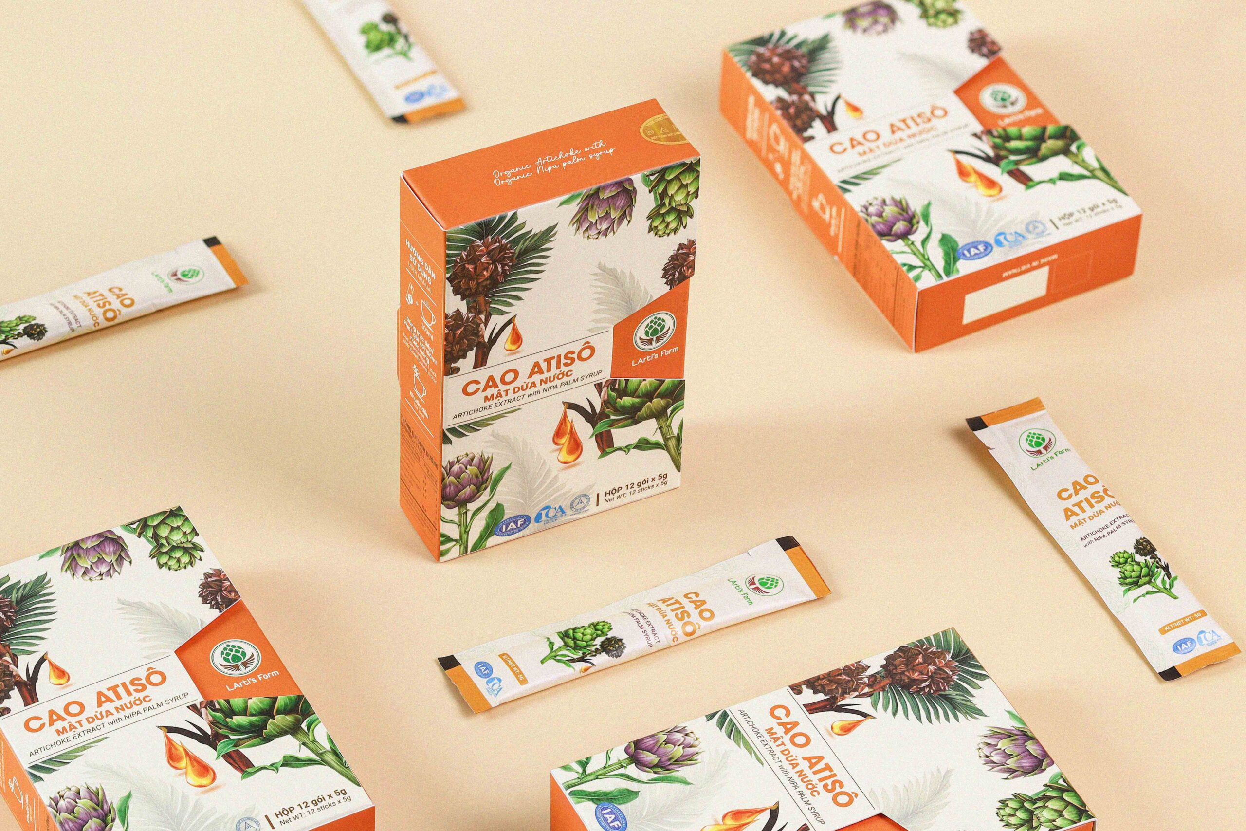
- Inconsistent Branding: Your logo should match your brand’s tone across your website, social media, and packaging.
✓ Tip: Before finalizing your logo, ask yourself: Does this design truly reflect the emotions and values you want your audience to feel? In addition, consider whether it aligns with your brand’s overall message. Ultimately, a strong logo should not only be visually appealing but also evoke trust, clarity, and connection.
The Best Fonts for Health & Wellness Branding
Although fonts might seem minor, they play a major role in shaping how your brand is perceived. In fact, the right font can make your wellness brand appear credible and professional. Conversely, the wrong one can undermine your message and ultimately turn potential clients away.
Here’s a breakdown of the best fonts for wellness branding and how they influence perception.

1. Serif Fonts: Traditional & Trustworthy
Serif fonts (like Times New Roman and Garamond) have small decorative strokes at the ends of letters. They add a touch of sophistication and reliability. For holistic, traditional, or organic wellness brands, a serif font can be an excellent fit.
✓ Best for: Herbal medicine, wellness coaching, holistic health practices.

2. Sans-Serif Fonts: Clean & Modern
Sans-serif fonts (like Helvetica and Montserrat) don’t have extra strokes, making them look clean and minimal. They create a modern, approachable, and fresh vibe. Many contemporary wellness brands favour sans-serif fonts because they’re easy to read and look great on digital platforms.
✓ Best for: Fitness apps, mental health platforms, meditation brands.

3. Script Fonts: Soft & Personal
Script fonts (like Pacifico and Dancing Script) mimic handwriting, giving your brand a personal and artistic touch. They’re great for businesses that want to feel warm, inviting, and unique—but should be used sparingly to avoid readability issues.
✓ Best for: Yoga studios, wellness influencers, handmade wellness products.
4. Custom Fonts: Unique & Memorable
Some brands go the extra mile and create a custom font to set themselves apart. If you want a one-of-a-kind look, a custom typeface can elevate your brand identity.
✓ Best for: Luxury wellness brands, exclusive spas, high-end skincare products.
✓ Tip: Whichever font you choose, make sure it’s easy to read across all platforms—from website headers to product packaging!
How to Create a Timeless Logo for Your Wellness Brand
Your logo shouldn’t just follow trends—it should be timeless. The last thing you want is to redesign your logo every few years because it looks outdated. Here’s how to ensure your logo remains fresh and relevant.
1. Keep It Simple
A simple logo is versatile, memorable, and professional. Avoid overly detailed graphics, complicated fonts, or cluttered designs.
Tip: If your logo is hard to recognize when it’s small, it’s too complex!
2. Choose Colours with Meaning

Colours influence how people feel about your brand. In wellness branding, colour psychology plays a big role.
- Green: Represents nature, health, and renewal (perfect for organic and eco-friendly brands).
- Blue: Symbolizes calmness, trust, and serenity (great for meditation and mental wellness).
- Purple: Evokes spirituality and transformation (ideal for holistic healing and alternative medicine).
- Earth Tones: Create a sense of grounding and warmth (perfect for natural beauty and Ayurvedic brands).
✓ Tip: Stick to two or three colours for a harmonious and balanced look.
3. Incorporate Meaningful Symbols
Wellness logos often include symbols that represent balance, healing, and well-being. But not all symbols work for every brand.
- Leaves and plants: Represent growth, healing, and nature.
- Circles: Symbolize unity, balance, and wholeness.
- Waves or curves: Evoke calmness, flow, and energy.
- Overused medical symbols: Avoid clichés like the generic heart monitor line unless it’s essential to your brand.
- Overused medical symbols: Avoid clichés like the generic heart monitor line unless it’s essential to your brand.
✓ Tip: Make sure your symbol is unique to your brand. You don’t want to look like every other wellness business!
Real-Life Examples of Effective Wellness Logos
Looking at successful brands can help you understand what makes a great wellness logo. Here are some real-life examples of logos that get it right.
1. Calm (Meditation App)

The Calm logo uses a soft, lowercase font with a calming blue color. It instantly communicates relaxation and mindfulness.
2. Lush (Natural Skincare)

Lush keeps it bold and simple with a sans-serif font and a minimal black-and-white color scheme. It reflects their fresh, no-fuss approach to skincare.
3. Headspace (Mental Wellness App)
Headspace’s simple orange circle represents warmth, positivity, and mindfulness. The minimalist design makes it highly recognizable.
4. Gaiam (Yoga & Wellness)

Gaiam’s logo features a circular mandala symbol, representing balance and holistic wellness. It’s a perfect example of how a simple shape can hold deep meaning.
Tip: Take inspiration from successful brands, but always aim to create something unique for your own wellness business.

At Raindow Creatives, we understand the importance of creating a logo that captures the essence of your wellness brand. With a focus on simplicity, meaningful symbols, and calming colours, we design logos that evoke trust, balance, and well-being. Whether you’re launching a yoga studio, wellness app, or organic skincare line, we’ll work with you to craft a logo that truly represents your brand’s values. Let us help you create a visual identity that resonates with your audience and leaves a lasting impression. We create this logo for you!


